Scallium
From spreadsheet chaos to a launch pipeline.
Merchants were running multichannel sales out of shared Excel files. Three design sprints, a story map and a round of usability tests later, they had one system for products, mapping, export and orders.
- Role
- Product Designer
- Timeline
- Jan 2021 — Apr 2022
- Platform
- Web
- Tools
- Figma, Storybook
- Scope
- 100+ screens · design system
(01) The problem
Scallium automates product-content work for large e-commerce and retail businesses, so a new product reaches market faster and content management costs less. Before it, the pipeline looked like this. Scroll.
Problem 01
Too slow to market.
It takes too long for merchants to enter the market, which is critical when there’s a lot of competition.


My role
Product designer from first workshop to design system, working closely with the product owner, stakeholders, the sales team and developers.
(02) Design sprint
For new, complex functionality the team worked in design sprints. First we worked to understand the problem, with the product owner and stakeholders. Then we brainstormed, argued it out and sketched.
This is the real planning board, with every sticky note translated in place. Hover one to see what it became, or flip to the original photo.

Map categories + extra categories
Look closely: “extra categories” is struck out in red on the board. The team kept category mapping and cut the rest from this scope.
Sprint 1
Sprint 2
Sprint 3

Paper sketches: import → creation → category mapping → value mapping
(03) Define
With a story map, we kept the best ideas and prioritized them: what ships in the first release, what goes into the second, and what waits for later iterations. For importing products, eleven stories made the cut.
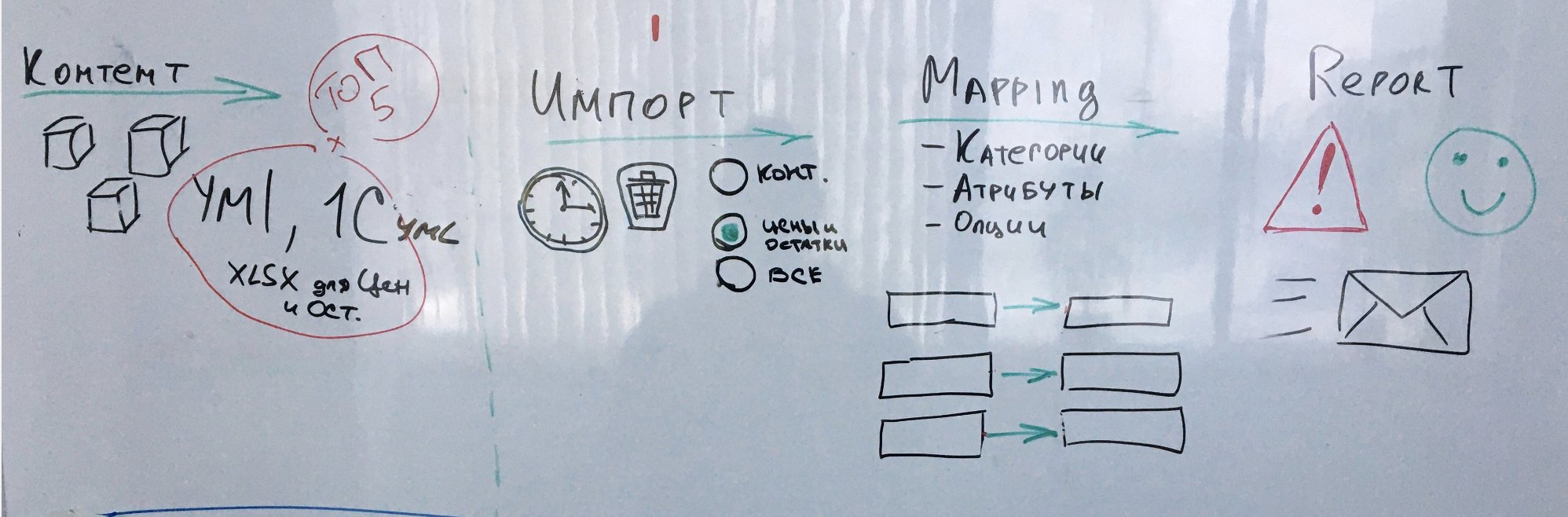
Content → Top 5 formats (YML, 1C, XLSX for prices & stock) → Import: schedule, delete, what to import
Mapping → categories, attributes, options: file field → system field
Report → warning or smile, and an email
Story map recreated from the original board. Top: the actual whiteboard flow the team sketched first.Blue = goal · yellow = activity · white = must-have story
(04) Prototype
Before testing with users, I built an interactive prototype in Figma to check how comfortable the interface was to use. Scroll to fly through the offers flow as it was wired.
01/08The offers flow, wired as a clickable Figma prototype and taken into usability testing.
(05) Usability testing
Every round followed a prepared plan with 3–5 target respondents: tasks, goals and the hypotheses we wanted to confirm or kill. The votes below are the real results from the product-card round. Scroll to replay it.
Round 1
Clickable prototype, three respondents, six tasks.
Tasks
- 1Create a product card
- 2Change the main category and go back to the list
- 3Add an offer and go back to the list
- 4On a model card, add an offer for a variant and come back
- 5Find every product that needs moderation
- 6Check the info: send for rework with comments, or approve
Goals
- Confirm or refute our hypotheses
- Learn how people actually work
- Find the pain points of the product card
Session report · 12 findings · 1 respondent
One respondent moderated content and hadn’t filled in a card by hand for a long time. Their session alone produced twelve findings. Scattered notes aren’t a result yet, so we cluster them.
Invisible affordances3
Things that were clickable didn’t look clickable.
Save & sequence4
The order of steps lived in people’s heads, not on screen.
Languages3
Multilingual content needed its own mental model.
Moderation status2
Statuses said what, but not why or what next.

The source: the original session report, with names redacted. After each round, the report was written up and the prototype was changed.
(06) After testing
The product card after the round of testing. Click any highlighted part to see the hypothesis or finding behind it, or filter by where the decision came from.
Sections, not tabs
Hypothesis 1 · confirmed 3/3. Every respondent struggled moving between tabs.
So the card became one page of sections: general information, categories, attributes, images, offers, channels.
(07) 100+ screens
More than a hundred screens came out of this process. Five of them are rebuilt here in code, and they work. Map a category, generate variants, walk an order through its statuses, run an export.
Mapping
The whiteboard’s Mapping column, shipped. The file is on the left, the system on the right, and every row carries a status. The counter shows how much is left.
Try: Pick a category for “Trousers”.
(08) Design system
ControlsActionsAccessibility
Scallium’s design system grew alongside the product: a visual language with guidelines, and a component library developers built in Storybook. The guidelines covered contrast, spacing, iconography, toasts, buttons and the do’s and don’ts for each.
On the left is a working sample, rebuilt in code with the same tokens. Change the controls.

The original guideline pages: palette, spacing, iconography, contrast, toasts, buttons.
(09) Outcome
01
Import & mapping
Upload by file or link, choose the fields, map categories and attributes, get a report written for people.
02
Models & variants
One model, a matrix of variants, and offers from many merchants for each.
03
Channels & export
Connect marketplaces, map parameters, export manually or automatically.
04
Orders
A configurable order lifecycle with alerts and time limits.
Lectera
A course studio for teachers. A learning path for students.
Continue to Lectera